Adapting To Screens: Top Tips For Effective Responsive Web Design
December 28, 2023
Neha Bawa
What has been updated from the old blog post:
- Added content to Intro section
- Added information about What is responsive design?
- Rewrote the ‘benefits of responsive web design’ section
- Added 3 more points to the ‘best practices of responsive web design’ section
Summary: This article highlights the importance of responsive web design (RWD) in today’s digital world where mobile device usage is prevalent. It outlines key practices for creating websites that adapt seamlessly across various devices, emphasizing the need for a mobile-first approach, streamlined content, and effective layout scaling.
Responsive web design has become a critical element in today’s digital landscape with a deep penetration of mobile devices and the Internet.
Given that more and more users are using mobile devices such as their smartphones and tablets to access the web, both for browsing and otherwise, website designs must become responsive to all devices and screen sizes to offer a seamless user experience.
Responsive web design is no longer just a trend; it’s a necessity in today’s digital world. This blog post explores the best practices in responsive design to help you create websites that not only look great but function seamlessly across all devices.
What is responsive design?
Responsive web design essentially entails a website design that is consistent on both desktops and mobile devices. This web design technique automatically adjusts a website’s appearance and elements as per the devices it’s viewed on.
Responsive web design should adjust to a variety of screen sizes, i.e. mobiles, desktops, and tablets to improve user accessibility and experience. Some of the common screen resolutions for responsive design are:
| Device Type |
Screen Resolution |
| Average mobile |
375 x 667 px |
| Small mobile |
360 x 640 px |
| Large mobile |
720 x 1280 px |
| Average laptop |
1366 x 768 px |
| Average desktop |
1440 x 900 px |
| Large desktop |
1920 x 1080 px |
Benefits of Responsive Web Design
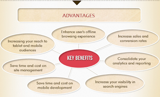
Some of the key advantages that ‘responsive’ web designs offer are:
Enhanced user experience
From desktops to smartphones, responsive web design ensures that your website looks and works the same. This increased user experience, as the website layout, content, and elements remain consistent across devices, thus making it easier to navigate and interact with.
Increased mobile traffic and higher rankings
With the rapid expansion of the Internet, web traffic has gone mostly mobile, thus making responsive web design a crucial ranking factor for search engines. A responsive and optimized website ranks higher in search results, thus attracting more traffic and enhancing its visibility.
Reduced costs and maintenance
Responsive web design reduces the cost and maintenance of a website, as it removes the need to design separate site versions for various platforms.
Reduced bounce rates
As responsive web design offers a streamlined user experience with easy navigation and readability, they are inclined to stay on the website longer, thus reducing the bounce rate.
Improved conversion rates
Responsive design provides a great user experience that can lead to increased conversion rates. Depending on your goal, the conversion rate can denote subscriptions, sales, and other call-to-actions.
Best Practices for Responsive Web Design
Here are a few vitals or best practices for a responsive website that managers and designers should know, before taking the plunge:
Take the Ascending Approach
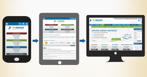
When we say that 12% of the globe’s web traffic is contributed by mobile users, there are concrete reasons why you should be considering the Responsive Web Design (RWD) approach. But it also implies that the mere consideration would not suffice.
The ideology is to provide mobile users with the best browsing experience in terms of utility, functionality, transition, aesthetics, etc. Talking the mobile-first approach therefore will help you focus and prioritize better, given the mobile screen constraints.
Website Designs when optimized for a small screen ensure only essential content is concentrated on, which is then optimally built to offer faster load times.
Once the design for the small screen is developed, the real estate available then can be used to provide visual appeal and navigational enhancements. Thus, it is all a win for you.
Scaling Site Layout
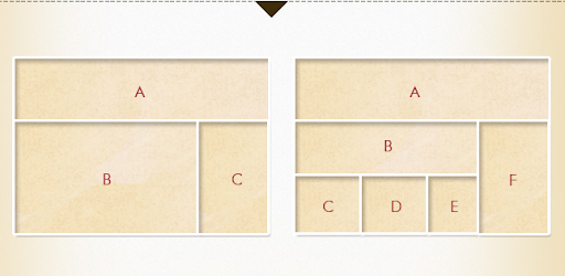
Website designs usually follow the grid layout. However, the responsive design considers a layout that fits the user’s screen size. You could follow a systematic procedure of sketching and then prototyping:
Sketching allows for creating rough drafts of the interactive and evolutionary layout ideas, which can be evaluated through discussions and brainstorming to be refined into the final draft.
Creating a draft of the layout helps in defining the layout that will be holding the codes and content, making it simpler to focus on the interaction and functionality aspects; saving a lot of time, otherwise wasted in layout mockups. You could use tools like:
- Responsive Sketchsheets from ZURB
- Fluid Grid Calculator
- Style Tiles
There are many more tools you could use or simply opt for the typical pen and paper sketch board. Though, we recommend the ZURB Sketchsheets as they are flexible and offer ample room to wiggle in your ideas.
Prototyping
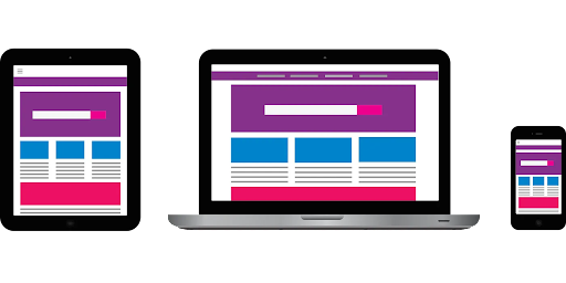
Image Source: blog.prototypr
Once the layout is decided upon, it’s time for the wireframe model entailing the determination of the markup, navigation, breakpoints, and content structure. Prototypes are fast, disposable and help you stay focused.
Again, in the context of the responsive web design, it’s recommended you begin with the smaller device design and work your way up. While there are standard frameworks available you could consider the following tools for prototyping:
- Visio ($14/month)
- OmniGraffle Pro ($249/one-time)
- Axure RP Pro ($42/month)
- Pencil (Free)
Content
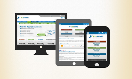
Kevin Stakem’s statement on content for responsive designs clearly stated the significance of taking the content-out approach, when he said, “Responsive design is about putting the right content in users’ hands according to the context of their interaction“.
Understanding the user’s needs is of utmost importance when it concerns content management. It has to be accessible and adaptable irrespective of the device it’s being viewed in.
The ideal way to begin is by starting with as compact a content, as possible and then arranging it in the best possible manner. This is what Garett Moon meant when he tweeted, “The web needs more than responsive web design. We also need responsive content management“.
Breakpoints
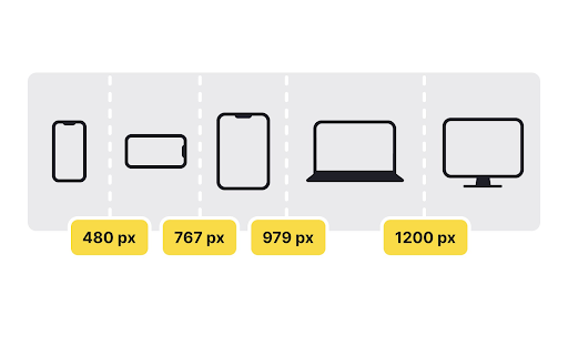
Image Source: app.uxcel
As Tim Caldec states, “Responsive design is not just another technique—it is the beginning of the maturation of a medium and a fundamental shift in the way we think about the web.”
The stereotype holds that breakpoints are device-centric and should be separately created for different screen sizes. When talking about ‘responsive’ designs, the focus should ideally be on the adaptability and flexibility of designs which are possible only when breakpoints are built around the content.
The Creative Blog’s article on breakpoint determination gives a clear insight into how breakpoints can be handled for responsive designs.
Adaptive Images
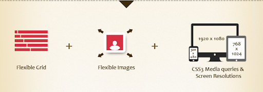
Images are another precarious area as depending on the size of the screen and the device that they are being opened on, they have to be resized and adjusted. The images, hence, need to be workable and flexible.
As Stephen Thomas puts forward in his article, “RWD takes a completely different approach: create a single website but let that website recognize and respond to its context”. Sherri Alexander has addressed some of the major issues faced with responsive image deployment in her article Choosing a Responsive Image Solution.
Media queries
Link: willmendesneto
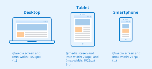
Use CSS media queries to implement various styling rules, that correspond to the device factors, such as screen width, resolution, and orientation. CSS media queries provide enhanced control over how the website looks on different devices.
Touchscreen-friendly
When creating a responsive website, ensure that the design is focused on touchscreen devices, as they are the most common displays these days. It’s best to create large and easy-to-press buttons and think about how elements like dropdowns and hover states work on touch devices.
Accessibility

Link: levelaccess
Ensure your responsive design is also accessible. This includes proper contrast ratios, keyboard navigability, screen reader compatibility, and ARIA (Accessible Rich Internet Applications) labels where necessary.
Final Thoughts
Responsive web design is a dynamic and evolving field. By adhering to these best practices, developers and designers can create websites that provide an optimal viewing experience for users, irrespective of the device they are using.
Remember, a responsive website is not just about looking good; it’s about providing a seamless and accessible user experience.